BiteBox.
Synopsis
A concept logo & branding work created for a custom meal-prep delivery service.

Logo construction
The BiteBox logo represents the core of the business - your nutrition in a box.
The formation of the logo is a combination of the letter 'B' and a 'bite' inside an isometric view of a box. The letter 'B' design intentionally resembles a bite, representing the delicious meals delivered in a box.
Using a simple, modern, and modified font for the text "BiteBox" reinforces the convenience aspect of the service. The logotype is legible and memorable, making it easy for customers to recognize and associate the logo with the BiteBox brand.
Color palette
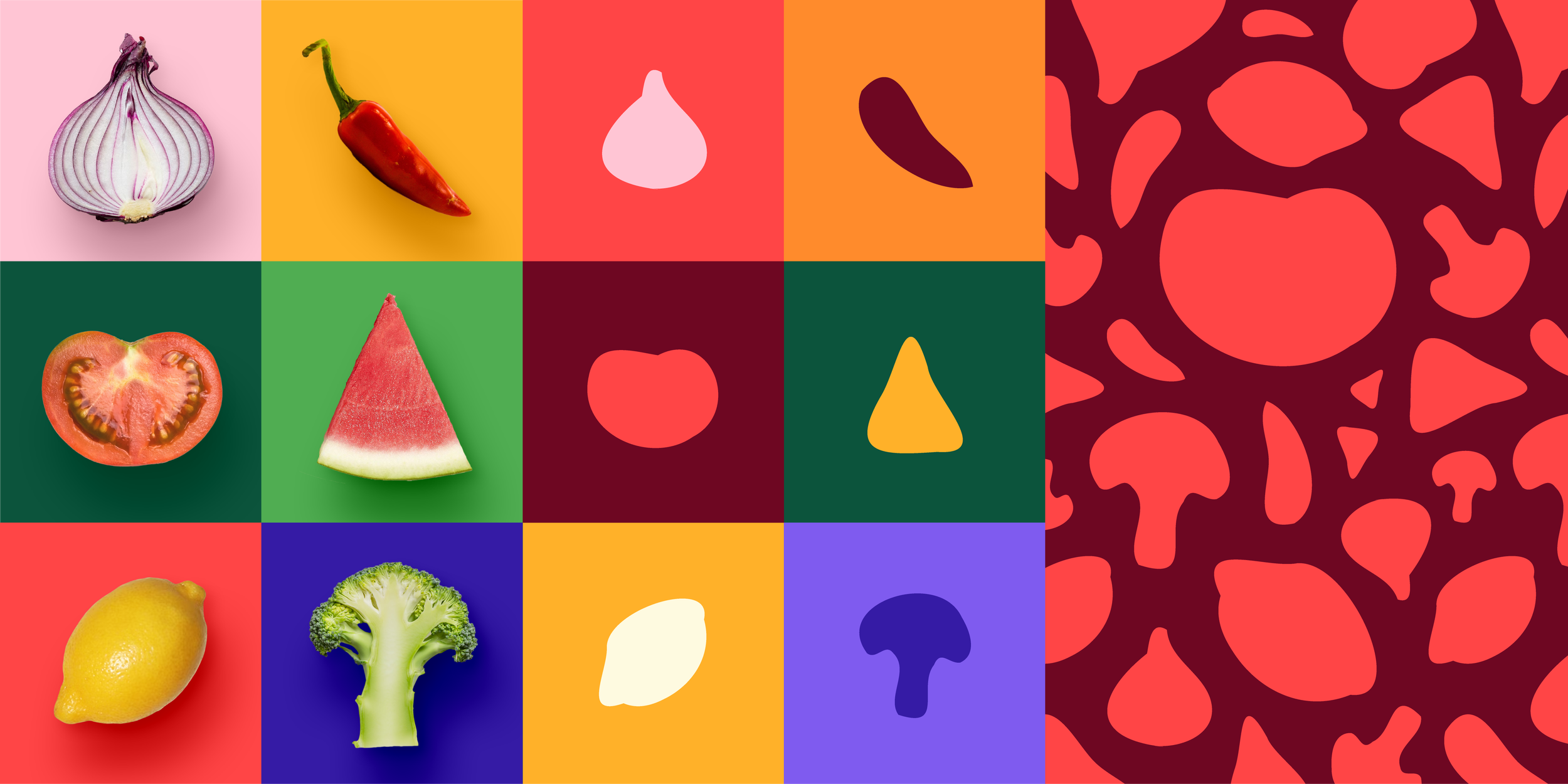
The inspiration for the colors comes from the fresh and vibrant ingredients.
The multi-colored system represents the variety and diversity of the meal options available to customers and also helps to create a dynamic and eye-catching visual identity that appeals to the target market. Moreover, it allows for versatility in the marketing materials to explore various visual styles while maintaining a consistent visual identity.
The colors can be picked based on the prominent color of the corresponding image.
Tone of Voice
Friendly and approachable - BiteBox is a service that makes healthy eating convenient and accessible for everyone. The brand should convey a friendly and welcoming tone that makes customers comfortable.
Inspiring - BiteBox is not just a meal delivery service but a lifestyle. The brand should inspire customers to take the first step towards a healthier and happier life through the convenience of healthy meal options.
Fun - BiteBox wants customers to enjoy the experience of healthy eating. The brand's tone should be light and playful, making healthy eating feel less like a chore and more like a fun and enjoyable experience.
Typography
Neighbor is a high-contrast font with a humanized design. It is a clean, modern font with good readability, ideal for longer texts, and flexible enough to be applied on different occasions. The weights in use are regular and extra bold.
Graphic Elements
Inspired by ingredients, these shapes may be used as patterns, image masks, or even as large areas to help with content layout, and can also be used in full color or outline.
Illustration and Photography Style
Illustrations will be sourced from the featured local artists to empower the art community in Dubai. Following are some examples of the type of preferred art styles.
The photography style should focus on people and food that effectively convey the brand's values and message. Highlighting the food itself will emphasize the quality and variety of available options, inspiring customers to make healthier choices.
The photography style should also be vibrant and appetizing, capturing the essence of fresh, healthy ingredients and tempting customers to try the meals for themselves. Overall, the photography style should reflect the fun, empowering, and inspiring tone of voice of BiteBox.
(Images sourced online)
Packaging
The packaging is an iconic part of the brand. It is a box made of sustainable materials, which features different illustrations from the featured artists to make it stand out from the competition.
The box's intentional design also resembles the logo icon when viewed from a specific angle.
Website & App
Social
Outdoor
Let’s work together!
Reach out to me on: shermidh.design@gmail.com


